PCR/qPCR Data Analysis
- PCR/qPCR Qualitative Analysis
- qPCR Data Analysis
- Deriving Accurate Cq Values
- Setting the Threshold
- qPCR Quantification Strategies
- Standard Curve Quantification
- Relative/Comparative Quantification
- Normalization
- Reference Gene Selection
- Analysis of Reference Gene Stability
- Alternative Normalization Methods
- Statistical Analysis and Data Visualization
- Visualization Techniques for Univariate Analysis
- Statistical Tests
- Hierarchical Clustering
- Principal Component Analysis
PCR/qPCR Qualitative Data Analysis
After a traditional PCR has been completed, the data are analyzed by resolution through an agarose gel or, more recently, through a capillary electrophoresis system. For some applications, a qPCR will be run with the end-point data used for analysis, such as for SNP genotyping. In each case, endpoint data provides a qualitative analysis after the PCR has reached plateau phase. In some cases, it may be possible to analyze end-point data to make a semi-quantitative analysis of the PCR yield, but quantitative measurements are more often made using qPCR and analysis of quantification cycle values (Cq)1 values.
qPCR Data Analysis
Throughout this guide, the factors that contribute to variations in the measurement of nucleic acid using PCR or qPCR have been highlighted. Each of these factors should be optimized to result in an assay that provides the closest possible value to the actual quantity of gene (target) in the reaction. The result of these processes is the generation of a set of Cq values for each target in each sample. The process of deriving and analyzing those Cq values to provide reliable data that represent the biological story is presented in this chapter.
Deriving Accurate Cq Values
Baseline Correction
A Cq value is determined for each target in each sample. Different analysis packages that are associated with different instruments, have alternative approaches for determining the Cq (and also use alternative names, e.g., Ct, Cp, take off point). It is beyond the scope of this guide to delve into the fine details of all of these algorithms. However, qPCR measurements that are based on amplification curves are sensitive to background fluorescence. The background fluorescence may be caused by a range of factors, which include choice of plasticware, remaining probe fluorescence that is not quenched, light leaking into the sample well, and differences in the optical detection for a given microtiter plate well. In well-designed assays, the background is low when compared to the amplified signal. However, variation in background signal may hinder quantitative comparison of different samples. Therefore, it is important to correct for background fluorescence variations that cause differences in the baseline (Figure 10.1).

Figure 10.1The components of amplification plots. This graph shows the increase of fluorescence with the number of cycles for different samples. The threshold is set above the detection limit but well below the plateau phase during which the amplification rate slows down.
A common approach is to use the fluorescence intensity during early cycles, such as between cycles 5 to15, to identify a constant and linear component of the background fluorescence. This is then defined as the background or baseline for the amplification plot. Due to transient effects, it is advisable to avoid the first few cycles (e.g., cycles 1 to 5) for baseline definition because these often show reaction stabilizing artefacts. The more cycles that are used for the baseline correction, the better the potential accuracy of the linear component of the baseline variations. Many instrument software packages allow manual setting of the cycles to be considered for baseline definition. These functions should be explored by the user and the temptation to accept default settings strongly resisted.
An example of the effect of baseline setting is shown in Figure 10.1. As can be seen, Cq values and the apparent shape of the amplification plot are affected by accurate baseline setting. In the example, the baseline for the curve labeled C3 has been incorrectly adjusted manually so that the baseline cycles calculated from the data in cycles 5 to cycle 31. This causes the curve to dip blow the zero baseline level (Figure 10.2A) with a Cq of 28.80. To correct this, the raw data, R, are viewed and the last cycle of the linear background (the last cycle before amplification) is identified. In Figure 10.2B, this can be seen to be cycle 22. The baseline is correctly set to be zero between cycle 5 and cycle 22 (Figure 10.2C), and the amplification plot is then corrected (Figure 10.2D). The corrected Cq is 26.12. Therefore, note that there was a substantial difference between the Cq values with the incorrect and correct baselines settings, demonstrating that setting the correct baseline is an important component of data analysis.
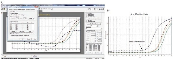
Figure 10.2A–B. A)Typical example of data dropping below the zero normalized fluorescence reading when the baseline setting is incorrect (blue amplification plot). B) Raw data of the same amplification plots showing the limit of the linear baseline and that the data are not at fault.
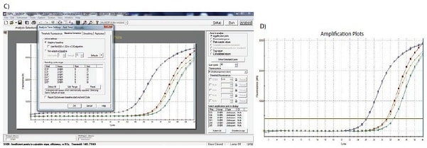
Figure 10.2C–D. C)The limits of the start and end of the baseline are defined using the appropriate software settings. D) Application of the corrected baseline setting results in good quality data
Setting the Threshold
Although some researchers advocate mapping individual amplification plot to estimate amplification efficiency and target quantities in measured samples2,3,4, the original and most common approach to deriving the Cq is to use a threshold. The wide adoption of this approach is likely to be due to the threshold method being a simple and effective quantification method.
The principle behind the threshold method is that; in order to visualize the associated fluorescent signal from the qPCR amplification, the signal must increase so that it is above the detection limit of the instrument (and therefore, the baseline; Figure 10.1). The number of cycles required for this to occur is proportional to the initial starting copy number of the target in the sample. Hence, more cycles are required for the signal to increase above the baseline if the original copy number is low and fewer cycles if the copy number is high. Since the baseline is set at the limit of detection for the system, measurements at the baseline would be very inaccurate. Therefore, rather than measuring to the intensity of minimum fluorescence that the system can detect, a higher fluorescence is selected and an artificial threshold is introduced.
The selection of the threshold intensity requires adherence to some fundamental principles. It is important that the threshold is set at a fixed intensity for a given target and for all samples that are to be compared. If there are too many samples to fit on a single plate, then an inter-plate calibration scheme must be adopted, e.g., inclusion of a replicated control that serves as an inter-plate control or a standard curve serial dilution. In theory, the threshold can be set anywhere on the log-linear phase of the amplification curve. However, in practice, the log-linear phase of the amplification may be disturbed by the background fluorescence baseline drifting, the plateau phase, or differences in assay efficiency and therefore amplification plot gradient at higher cycles. It is recommended that the threshold is set as follows:
- Sufficiently above the background fluorescence baseline to be confident of avoiding the amplification plot crossing the threshold prematurely due to background fluorescence.
- In the log phase of the amplification plot where it is unaffected by the plateau phase (this is most easily seen by viewing the amplification plots on a log view, Figure 10.3A).
- At a position where the log phases of all amplification plots are parallel.
The process of threshold setting is demonstrated in Figure 10.3. In Figure 10.3A, the amplification plots are viewed on a Y axis log scale, thus providing a visual expansion of the log phase of amplification and presenting this as a linear portion of the amplification plot. The threshold is set at the highest fluorescence intensity (refer to Y axis) that is within this log phase and where all amplification plots are parallel. The scale is then returned to the linear view (Figure 10.3B) showing the highest setting that fulfils the threshold setting requirements. Alternatively the threshold may be set at the lower end of this log phase (Figures 10.3C and 10.3D). As long as the log phase of the amplification plots are parallel, the ΔCq between samples is unaffected by the threshold setting.
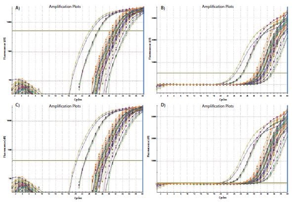
Figure 10.3The threshold setting influences the absolute Cq recorded and can influence ΔCq between samples. A). Using a log vs linear plot of the data, the threshold is set at the highest fluorescence intensity but where the amplification plots show parallel log phases. B). The threshold setting is maintained from A) and is displayed on the linear vs linear plot. C). Using a log vs linear plot of the data, the threshold is set at the lowest fluorescence intensity but where the amplification plots show parallel log phases. D). The threshold setting is maintained from C) and is displayed on the linear vs linear plot. In each case, the ΔCq values between samples are the same.
The requirement for a threshold setting at a position where the log-linear phases of the amplification plots are parallel becomes more pertinent when data at higher cycles are included in the analysis. The threshold setting procedure that was described for the data in Figure 10.3 was repeated on a data set of higher Cq and the results presented in Figure 10.4. The resulting Cq data in Table 10.1 serve to illustrate the variability in the Cq, and more importantly, the ΔCq values for three amplification plots with three threshold settings (Figure 10.4). The ΔCq values and therefore the estimate of the relative quantity of target in each sample are highly dependent on the setting of the threshold (Figure 10.4) because the amplification plots are not parallel.
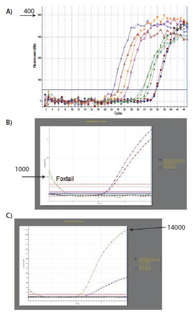
Figure 10.4.The analysis that was performed and demonstrated in Figure 10.3 was repeated using a different data set. In this case, the amplification plots are not parallel due to a difference in efficiency of the reaction at high Cq. The lowest settings for A) and B) result in different ΔCq values than the highest settings for C) and D) (Summarized in Table 10.1).
qPCR Quantification Strategies
Accurate baseline and threshold setting is imperative for reliable quantification. After setting each of these, a Cq value is generated and this is used as the basis for quantification. The quantity of target in a given sample is then determined using either a standard curve or relative/comparative quantification.
Standard Curve Quantification
As the name implies, standard curve quantification requires the use of a standard curve to determine quantities of targets in test samples. All quantities determined for samples are, therefore, relative to the quantity assigned to the standard curve. This requires running additional, external standards alongside every set of sample reactions. The choice of material for the standard curve is important for eliminating potential differences in quantification due to differences between assay efficiencies in the samples and in the standards. The primer binding sites of the external standards must be the same as those in the target, contain sequences that are the same as the target, have similar complexity and be handled in as similar a manner as possible. Therefore, when measuring the concentration of a target in cDNA, it is preferable to measure the same cDNA in a serial dilution of a control sample. However, for some studies there are practical reasons that prevent this, so it is important to reproduce the sample conditions as closely as possible, e.g., by adding gDNA from a species unrelated to the test species, to an artificial oligonucleotide standard or linearized plasmid carrying the standard sequence. Once a suitable construct or amplicon is identified, a standard curve of serial dilutions is generated. The Cq for the target is determined for each of the standards and plotted against the concentration or relative concentration/dilution factor on a log scale. This results in a standard curve that is then used to determine the concentrations of test samples by comparison of the Cq values derived from amplification of the unknown samples. When using a standard curve for quantification, the threshold setting must be kept constant for determination of Cq for the standard and for the samples on the same plate. The threshold can differ between plates.
Relative/Comparative Quantification
Relative or comparative quantification uses the difference in Cq as a determinant of the differences in concentration of the target sequence in different samples. Rather than measuring quantities of target per sample as with the standard curve method, this leads to sets of data showing fold changes between samples.
In the original form of this approach5, the efficiency of all of the assays was assumed to be 100%, leading to the assumption that a Cq difference of 1 (ΔCq = 1) was as the result of a 2-fold difference in target. To determine a fold change in the target or gene of interest (GOI), the data must also be referenced to a loading control (reference gene, ref; see the following for a discussion regarding data normalization).
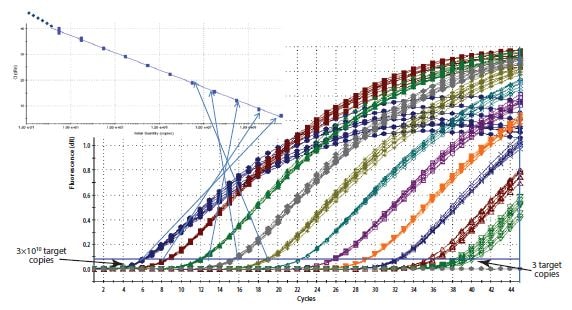
Figure 10.5.Construction of a Standard Curve. The Cq recorded for each sample of a dilution series is plotted on a log linear scale against the relative concentration.
In Equation 1, the ratio of the GOI, after correction to the ref gene, in 2 samples (A relative to B) is measured as: 2 (assuming 100% efficient reactions) raised to the power of the differences in the Cq values for the GOI divided by 2 raised to the power of the differences in the Cq values for the ref gene

Equation 1.Original (Livak) Relative Quantification Model.
However, as illustrated in Assay Optimization and Validation, the efficiencies of reactions vary considerably and this can have a large impact on data. Therefore, the assumptions in Equation 1 were addressed (Equation 2)6, so that the differences in reaction efficiencies could be incorporated into the analyses. In this case, the amplification factor 2 is replaced by the actual efficiency of the PCR (as determined by a standard curve analysis; see Assay Optimization and Validation).

Equation 2.Efficiency Adapted (Pfaffl) Relative Quantification Model
As an example of using the efficiency adapted (Equation 2) relative quantification model, a set of Cq values are presented in Table 10.2. The efficiency for the GOI is 1.8 and for the ref gene 1.94.
This is a very simple example of a study with the requirement to measure the fold difference between one gene in two samples and after normalization to a single reference gene. The ratio shows the fold change of the GOI in sample 2 relative to sample 1, after correction to the single Ref gene. However, it has become apparent that selection of a single, suitable reference gene is often impossible and, therefore, more sophisticated approaches for normalization have been suggested.
Normalization
The major objective of most PCR-based experiments is to address the basic question of whether the target is present in the sample (unknown, UNK). At the very simplest level, this is answered by running a gel and examining the fragments for the presence or absence of the desired GOI. When the fragment is present, the confirmation of fragment size gives reassurance of a positive result. However, when absent, there is the potential of a false negative result. Therefore, it is critical to repeat the test assay and also perform at least one additional PCR to serve as a loading and positive PCR control. The universal, inhibition control assay, SPUD (see Sample Purification and Quality Assessment), can be used to support confidence in a negative result. An alternative approach is to run an assay that is specific to a reference gene or genes. Traditionally, PCR assays detecting the reference genes, GAPDH, 18S ribosomal RNA, or β actin were run alongside those for the GOI and the resulting fragments visualized on a gel. GAPDH, 18S ribosomal RNA, and β actin are constitutively expressed and were therefore used as loading controls in semi-quantitative analyses. However, it soon became apparent that these genes are not ubiquitously expressed at the same concentration in all cells, regardless of experimental design. Therefore, the need arose for a stable reference when the objective was to measure relative nucleic acid concentrations, usually cDNA but also gDNA when, for example, examining the copy number variation of a gene.
Normalization is the process of correcting technical measurements to a stable reference in order to examine true biological variation. There are many methods for normalizing technical differences which means that the appropriate approach for the specific experiment must be selected and validated7. It is critical to recognize that adoption of inappropriate normalization techniques may be more detrimental to the overall analytical process than not normalizing at all8.
The Effect of Sample Quality On Assay Normalization
The effect of sample integrity and purity on target quantity measurements by qPCR and RT-qPCR was discussed at length (Sample Purification and Quality Assessment, Sample Quality Control and Reverse Transcription, Reverse Transcription). It was demonstrated that inhibitors in the sample and RNA degradation have a differential effect on the measurement of a given target9. Inhibitors effect the measurement of any target but to a different degree, depending on the assay design. Degradation of total RNA effects the measurement of mRNA and miRNA10, again being highly dependent on the overall experimental design. Therefore, it is critical to consider the effect of template concentration on the RT reaction and the effect of the sample quality on data after normalization. Normalization will not counter the effect of low quality assays or samples (see Assay Optimization and Validation).
Normalization Approaches
Ideally, normalization methods counteract variability that may be introduced during the multi-step process that is required to perform a qPCR analysis (Figure 10.6). However, applying normalization at any one stage in the process may not control for technical error and/or bias that was, or will be, introduced at an earlier or later stage, respectively. Normalization methods are not mutually exclusive and so adopting a combination of controls is recommended11.
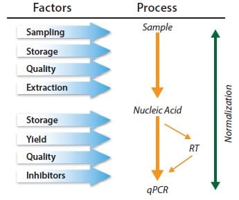
Figure 10.6.qPCR is a multistep process and each step must be controlled. Normalization must be considered within a series of controls.
The objective of normalization is to provide a stable reference point against which the measurements can be referred; therefore, the choice of normalization factor must be a measurement which is stable throughout the experiment. This may be stable reference gene(s), or one of the alternatives, such as cell number, tissue mass, RNA/DNA concentration, an external spike12, or a representative measure of the global expressed genes.
Reference Gene Selection
Reference genes are targets whose quantity does not change as a result of the experiment. When quantifying DNA copy number variation in which the number of copies of the sequence of interest may change, the measurement is simply normalized by targeting an alternative genomic region that is known not to change. An example of how this may be applied is when measuring Human Epidermal Growth Factor Receptor 2 (HER-2) genomic amplification13. HER-2 genomic instability is a prognostic indicator in breast cancer and accurate measurement of HER-2 amplification status is important in patient management. HER-2 status can be measured by qPCR by comparing the copies of HER-2 with another genomic target that is acting as a control.
When measuring gene expression, reference genes are targets with mRNA concentrations that do not change as a result of the experiment. An example study would be one in which the effect on the expression of gene X is being measured after addition of a mitogenic compound to a cell monolayer. A reference point is required in order to measure the change in gene X. Therefore, another gene (or genes) that are known not to be affected by the mitogen in question is also measured. This provides the researcher with the immediate challenge of finding a mRNA target that is not affected by the experimental procedure, before being able to study the GOI. This process of validation of reference genes is fundamental for an accurate measurement of the GOI. The most widely used approach to normalization is to ignore this process and normalize the gene expression data to a single, unvalidated reference gene. This practice is not recommended and is in direct opposition to the MIQE guidelines1. The quantification of mRNA by RT-qPCR has routinely been compromised by the incorrect choice of reference genes. It is not acceptable to follow the relatively common practices of using a reference gene because the primers are in the freezer already, it was used historically on Northern blots, it is used by a colleague, or used in another laboratory for a different experiment. Reference genes need to be validated under specific experimental scenarios to be assured that the reference gene in question is not affected by the experiment. If this validation is not carried out and the reference gene is affected by the experiment, the results could be incorrect and subsequent interpretations are likely to result in meaningless data8.
There is a range of scientific literature describing different methods for normalization7-14 as well as a plethora of publications describing the protocols required to identify the most appropriate normalizer genes for a given experimental scenario. While in the past, a key question was whether to select single or multiple reference genes, lower running costs means that current best practices have moved towards measuring multiple reference genes.
Selection of stable reference genes requires the analyst to evaluate the stability of qPCR for a number (usually 10 to 20 genes) of candidate mRNA targets7 on a subset of samples that represent the test and control mRNAs. A full protocol is provided in Appendix A, Protocols, of this guide and may be used in combination with different analytical methods using programs such as REST15, GeNorm14, Bestkeeper16, or NormFinder17. This procedure is described in more detail in the following section, Analysis of Reference Gene Stability.
Analysis of Reference Gene Stability
The reference gene is literally the pivot point for qPCR relative quantification assays. It is therefore critical for the reliability of the entire assay that the reference gene is stable. If the reference gene expression varies between samples, the variation will be directly transferred to the quantification results and the added variability may obscure the desired observable biological effect or, even worse, may create an entirely artificial appearance of a biological effect, one that is unrelated to the actual gene of interest. For these reasons, it is strongly recommended that several safety measures are followed to render reference gene variability insignificant and make measures of biological effects as significant as possible.
Arguably, the most important safety measure is to use not only one, but two or more, reference genes. The expression of several reference genes can be averaged to reduce technical variability due to normalization. This can be useful to improve significance in measurements of small biological effects. However, more importantly, two or more reference genes provide mutual controls for maintained stability and control for unexpected occurrences that may influence the expression levels of one of the reference genes. With a single reference gene, there is a risk that unexpected influences of gene expression may be undetected in the assay.
Another safety measure is to use more than one method of identifying stable reference genes. The following is an example to illustrate several aspects of reference gene normalization, including a possible advantage of using both geNorm and NormFinder methods on the same data set.
Table 10.3 holds a list of reference gene candidates that were evaluated during a workshop we previously conducted with EMBL. Samples were collected from a human cell culture in two different treatment groups. This data set will be used to demonstrate aspects of reference gene validation.
Both the NormFinder and geNorm algorithms have been developed with the assumption that testing a multitude of reference gene candidates can be used to rank the stability of individual reference gene candidates. The assumption may be true if, for example, all reference gene candidates vary stochastically around stable expression levels. However, this may not necessarily be true in reality. To avoid misleading results, it is therefore prudent to avoid regulated and in particular co-regulated reference gene candidates.
The list of reference gene candidates shown in Table 10.3 was specifically chosen to select genes that belong to different functional classes, reducing the chance that the genes may be co-regulated. A notable exception is GAPDH, which is present here in two versions. Although this does not affect this analysis, it is best practice is to avoid multiple entries of genes that may be suspected of being co-regulated.
The first algorithm to be demonstrated is geNorm. This provides an evaluation of gene stabilities by calculating a gene stability measure called the M-value, which is based on pairwise comparisons between the analyzed reference gene candidate and all other reference gene candidates in the data set. It is performed in an iterative fashion, meaning that in this example, the procedure is first performed on all 15 reference gene candidates, the least stable is removed, the process is repeated on the remaining 14, the second least stable candidate is removed, and so on until two reference genes remain.
There may be times when identification of the most stable reference gene may be particularly challenging. One case may be when all reference gene candidates perform poorly. Another case may be if all reference gene candidates perform well. To distinguish between these two cases, a useful guideline is that reference genes with an M-value below 0.5 may be considered stably expressed.
The second algorithm to be demonstrated is NormFinder, which is a freely available reference gene analysis package (Appendix B, Additional Resources). The underlying algorithm takes a ANOVA-like approach to reference gene stability evaluation in that the whole and subgroups are analyzed for variations. One advantage of this is that the obtained measures are directly related to gene expression levels. A standard deviation of 0.20 in Cq units therefore represents about 15% variation in copy number expression levels of the particular reference gene candidate.
For convenience, in this demonstration, both of these analysis packages are accessed using GenEx (MultiD) data analysis software, but they are also available as independent packages (Appendix B, Additional Resources).
The bar diagrams shown in Figure 10.7 illustrate reference genes ranked according to their respective stability measures using both algorithms. In addition, a graph showing the accumulated standard deviation from NormFinder indicates that a combination of up to the three best reference genes may yield stability improvements.
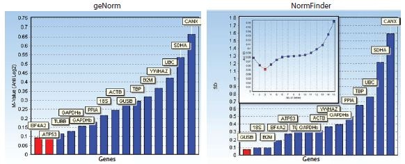
Figure 10.7.Bar diagrams showing stability measures: M-values for geNorm and standard deviations for NormFinder. In addition, a graph showing the accumulated standard deviation from NormFinder indicates that a combination of up to the three best reference genes may yield stability improvements. The data set was generated from assays designed for the reference gene candidates shown in Table 10.3 and measured on a human cell culture in two different treatment groups. Notice that, in this instance, the reference gene stability algorithms geNorm and NormFinder do not agree about the best reference genes.
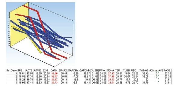
Figure 10.8.Mean centered expression profile of the reference gene candidates of the two samples in each treatment group. Samples 1 and 2 belong to the first treatment group and samples 3 and 4 belong to the second treatment group. Expression profiles of SDHA and CANX are indicated in red. Expression profile of UBC is indicated in yellow. The table lists the measured Cq values in the data set.
Due to the deviating expression profiles, it is possible that SDHA and CANX are regulated by the different treatment alternatives and therefore, are not suitable as reference genes. Removing these from the data set and repeating the analysis results in agreement between both algorithms and that the best choice of reference genes is EIF4A2 and ATP53 (Figure 10.9). In the NormFinder calculation of accumulated standard deviations, it is also apparent that the addition of more reference genes does not improve stability.
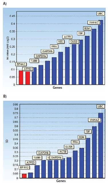
Figure 10.9.Inspection of the expression profiles and measured Cq values (Figure 10.8) raised concern that SDHA and CANX may be co-regulated in the applied assay. The co-regulation may disrupt reference gene stability algorithms. Bar diagrams showing stability measures: A) M-values for geNorm and B) standard deviations for NormFinder. The data set is the same as the one used in Figure 10.8 except that the data for SDHA and CANX have been removed. Notice that with this reduced data set the reference gene stability algorithms geNorm and NormFinder do agree about the best reference genes.
The analysis of data in this example serves to illustrate that using geNorm and NormFinder in parallel allows for identification of co-regulated reference gene candidates and that removing these genes from further studies provides a final identification of reference genes that can be adopted with more confidence than after using a single analysis. Identification and selection of stable reference genes leads to greater security of data analysis.
Alternative Normalization Methods
While normalization to reference genes is the most common method for assay normalization, there are situations where this approach is not suitable, such as when a large number of genes in a heterogeneous group of samples is to be compared, or when profiling miRNA. In these scenarios it is necessary to adopt an alternative strategy.
Normalization to Tissue Mass or Cell Number
Measurement of cell number or tissue mass to use as a normalization factor is not as simple as it may first appear. Cell culture experiments are relatively easy to normalize based on cell count. However, addition of a treatment might impact cell morphology, complicating the ratio of cell number to total RNA/genes expressed when compared with a control culture. The experimental treatment may result in the production of extra cellular matrix causing differences in nucleic acid extraction efficiencies.
Biological tissues can be highly heterogeneous within and between subjects, with more variation being apparent when healthy tissue is compared with diseased tissue. Even apparently less complex tissues, such as blood, can differ considerably in cell count and composition such that gene expression varies considerably between apparently healthy donors18.
Any delays in the processes used to purify nucleic acid will result in alterations in the measured RNA. For example, delays in processing peripheral blood mononuclear cells and extracting RNA from cells, results in considerable changes in gene expression19. The methods underlying the extraction procedures are also major sources of technical variation. Even the isolation process selected for sampling blood derived cells and RNA purification result in differences in apparent gene expression profiles20. Therefore, the first normalization consideration is to ensure that collection and processing is absolutely identical for all samples. It is then critical to perform sufficient quality control to be certain of the sample concentration, integrity, and purity (Sample Purification and Quality Assessment and associated protocols in Appendix A).
Normalization to RNA Concentration
As a minimum, an estimation of template concentration (DNA for qPCR or RNA for RT-qPCR) is important and, as mentioned in Sample Purification and Quality Assessment, it is critical to ensure that the same instrument is used for all measurements because the determination of nucleic acid concentration is also variable and technique dependent.
When measuring total RNA concentration, the vast majority of the sample is composed of rRNA, with only a small fraction consisting of the mRNA of interest when examining gene expression, or the sncRNA when examining gene expression regulation. This means that if the rRNA concentration increases a small amount but the mRNA remains constant, the total RNA concentration will increase. The mRNA concentration must increase a significant amount to cause an apparent increase in the total RNA concentration. Hence, rRNA concentration is an unreliable measure of the mRNA concentration, but for many protocols, equal RNA concentration is required to ensure accurate reverse transcription (see Reverse Transcription).
Normalization to Global Gene Expression
When measuring large numbers of targets, the analyst can estimate the global mean of the total gene expression and identify regulated RNA sequences that deviate from this mean. This approach is conventionally used for normalization of gene expression arrays. It is a valuable alternative to using reference genes and may be preferable where many targets are being measured.
Another recently explored approach is the measurement of endogenously expressed repeat elements (ERE) that are present within many of the mRNAs. Many species contain these repeat elements (ALU in primates, B elements in mice), which can provide an estimation of the mRNA fraction. Measurement of these target sequences has been shown to perform as conventional normalizing systems9 (Le Bert, et al., in preparation) and may offer a universal solution or an alternative for complex experiments where stable reference gene combinations are unavailable.
Normalization of miRNA Data
As yet there have been no reports of a miRNA universal reference gene. Therefore, the selection of normalization system is still rather empirical. When possible, stable invariant miRNAs may be identified from genome-wide approaches, i.e., microarrays. Small nucleolar RNAs (snoRNAs) have also been used as reference genes. Global gene expression is also a useful method of normalizing miRNA expression when a stable reference is unknown and several hundred targets have been analyzed21,22,23. This method is more appropriate for those using approaches resulting in capture of all miRNAs as cDNA in a multiplexed form, e.g., Exiqon and miQPCR systems (refer to Castoldi et al. in PCR Technologies, Current Innovations24).
Biological and Technical Replicates
The purpose of normalization is to avoid systematic errors and to reduce data variability for the eventual statistical analysis. Another important aspect of setting up data for statistical analysis is the use of data replicates.
Biological replicates are absolutely necessary for statistical analysis. Statistical significance levels are often set at a 5% significance cut-off. For biological effects close to such a significance level, it may be necessary to have at least 20 biological replicates to determine the assays significance level (1:20 corresponding to 5%). In fact, it has been suggested that at least 50 times the number of observations are required to be recorded for an accurate estimate of significance25, i.e., on the order of a thousand biological samples. Naturally, practical limitations seldom allow for biological replicates at these levels. Furthermore, accurate estimates of the number of necessary biological replicates to meet a given significance level also depend on the level of variability of the data. Nevertheless, it is important to realize that a common mistake is to underestimate the necessary number of biological replicates to be able to arrive at reliable conclusions. It is recommended to perform an initial pilot study to evaluate the assay’s inherent variability and the potential size of the observable biological effect in order to have a good basis to estimate the necessary number of biological replicates26.
Technical replicates are not used directly for the statistical analysis. Instead, technical replicates are used to backup samples (in case some samples are lost in the technical handling process) and to improve assessment of data accuracy. Technical replicates can improve data accuracy if the assumption holds true that they vary stochastically around the accurate measurement at each stage of the technical handling process. The average of the technical replicates is closer to the accurate measurement. The effect of averaging technical replicates can be illustrated by noting the size of the confidence interval in a simulated data set with a predetermined variability, i.e., standard deviation set at one. As seen in Table 10.4, the confidence interval becomes smaller with an increasing number of technical replicates (samples), indicating a more precise estimate of the accurate measurement. Furthermore, the narrowing of the confidence interval is most dramatic at the low number of technical replicates. Increasing the replicate number from 2–3 decreases the confidence interval from 8.99–2.48, i.e., a more than 3-fold improvement of the precision in the estimate of the accurate measurement. While additional replicates continue to improve the estimate of the accuracy of the measurement, the effect is at a decreasing magnitude. Therefore, it is apparent that in cases where technical handling variability is an issue, it may be a great advantage to use triplicates rather than duplicates.
Technical replicates can be collected at several stages throughout the sample handling process, including RNA extraction, reverse transcription and qPCR detection. If technical replicates are detected at several stages, a nested experimental design is generated. A pilot study that takes advantage of a nested experimental design may help to identify sample handling stages that contribute the most to technical handling errors and an optimal sampling plan can be calculated based on this information27.
Statistical Analysis and Data Visualization
Scientific analysis of biological data centers on the formulation and testing of hypotheses. The formulation of a hypothesis requires a detailed understanding of the conditions and variables of the assay. Successful testing of a hypothesis involves careful execution and an appropriate experimental design to maximize the desired observable signal while minimizing technical variability. In this context, it is useful to distinguish between exploratory and confirmatory studies (Figure 10.10).
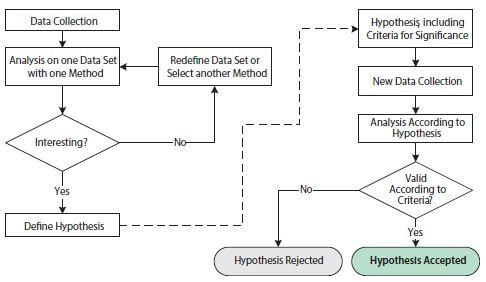
Figure 10.10.Flowchart illustrating operations involved in exploratory and confirmatory statistical analyses. The left-hand side of the figure, before the dashed arrow, shows operations in an exploratory statistical study. The right-hand side of the figure, after the dashed arrow, shows operations in a confirmatory statistical study.
The purpose of the exploratory study is to analyze data with one or several different techniques in order to substantiate a hypothesis. The data set may be redefined and/or different analysis techniques may be employed repeatedly in order to support one or several hypotheses. The exploratory study is thus very flexible to the specifics of any scientific question. However, the repeated probing of hypotheses testing on one data set may lead to issues that undermine statistical conclusions. This is due to multiple testing, which refers to the fact that a statistical test with several independent hypotheses is more likely to yield a positive significance and that the chances of this increases as additional hypotheses are tested, even if the underlying probability distributions are identical. To avoid misleading statistical results, the exploratory study is therefore often combined with a confirmatory study.
The requirements for a confirmatory study are based on much stricter statistical criteria. First, the hypothesis of study, including criteria for significance, needs to be defined before the collection of data and before the analysis. In addition, the data set for analysis needs to have been collected exclusively for this purpose. It is statistically incorrect to reuse the data set from the exploratory study in the confirmatory study since that data set would inherently favor the proposed hypothesis. The end result of the confirmatory study is a rejected or accepted hypothesis according to the pre-stated criteria.
Statistical Tests
For statistical testing, the likelihood that an observed phenomenon occurred by random chance is analyzed. This is called the Null hypothesis28. If the observed phenomenon is rare according to the Null hypothesis, the conclusion is that it is unlikely that the Null hypothesis is valid. The Null hypothesis is rejected and the likelihood of the alternative hypothesis as significant is accepted.
The estimated likelihood that the observed phenomenon occurred by random chance is called the p-value. The p-value is measured in a range from 0 to 1, or equivalently, in percentage units. The statistical criteria for a confirmatory study include an alpha cut-off under which calculated p-values would indicate significance for the observed phenomenon. An alpha cut-off of 5% is commonly used, although this must be adjusted to fit desired and necessary criteria that are specific to the subject of study.
Many algorithms have been developed for calculating p-values under various assumptions and for different purposes. A common algorithm is the Student’s t-test. The Student’s t-test is used to calculate a p-value based on the difference in the mean values between two groups of data. The main assumption of Student’s t-test is that the two groups of data are independent and conform to normal distributions. An advantage of the Student’s t-test is that it is powerful, compared to nonparametric statistical tests29. A non-parametric test that is equivalent to the Student’s t-test may be one of the most well-known non-parametric statistical tests; the Wilcoxon rank-sum test (sometimes called Mann-Whitney U test; not to be confused with Wilcoxon signed-rank test which is used to compare two paired groups). Non‑parametric statistical tests, such as the Wilcoxon ranksum test, have an advantage over parametric statistical tests, such as the Student’s t-test, in that they do not depend on prior assumptions of the data set distributions. A Kolmogorov- Smirnov’s test for normal distribution may be used to decide whether to apply the Student’s t-test or one of the nonparametric tests
In addition to the choice of algorithm for p-value calculation, data sets that are fed into the p-value calculation algorithm may be manipulated to facilitate observation of desired properties in the data set. The combination of raw data manipulation steps and choice of p-value calculation algorithm is part of building a hypothesis model.
There is a high level of freedom in building hypothesis models in the exploratory phase of a statistical analysis and this is an important part of scientific inquiry. However, a hypothesis is never proven using a scientific, statistical approach. A correct scientific approach is to formulate a Null hypothesis, use an independent (preferably a newly collected) data set, and accept or reject the Null hypothesis according to the confirmatory study flowchart (Figure 10.10).
Visualization Techniques for Univariate Analysis
Just as there are many analysis methods available, there are also many data visualization techniques from which to choose. For univariate data analysis, a simple bar diagram with associated error bars is an appropriate visualization technique. Even though this is a common and simple visualization technique, there are issues that are worth emphasizing. First, error bars may illustrate different sources of variability; the inherent variability of the data (the standard deviation, SD) or the precision by which the mean value has been determined. Secondly, the precision by which the mean value has been determined can be illustrated in different ways, but it ultimately depends on a combination of the inherent variability of the data together with the number of samples (N) and in its raw form, it is called the standard error of the mean (SEM, Equation 1):

Equation 1. SEM
However, the SEM is not a very intuitive measure and it is not straight forward to compare SEMs from different experiments in a meaningful way. A more popular way of illustrating the precision of the estimated mean and indicating statistical significance in a graphical way, is the confidence interval (CI, Equation 2):

Equation 10-2.Cl
The presence of the SEM can be recognized in the equation for the confidence interval as the ratio between the standard deviation (SD) and the square root of the number of samples (N) and thus it is evident that the confidence interval is based upon the SEM. The lower limit of the confidence interval is constructed by subtracting the SEM multiplied by a percentile of a t-distribution from the mean. The upper limit of the confidence interval is constructed by adding the SEM multiplied by a percentile of a t-distribution from the mean. The confidence level of the confidence interval is set by the confidence level associated with the critical value t*; typically a 95% confidence level.
Figure 10.11 shows a bar graph with error bars denoting the 95% confidence interval within each experimental group, highlighting the uncertainty associated with the mean estimate for an example gene expression in samples from different organs after treatment with several drug doses. In addition, the t-test statistical significance p-values are shown for the difference in gene expression between the control samples and each of the three different samples from different drug dose responses, indicated by means of an asterisk notation. It is customary to have one asterisk correspond to a p-value below 0.05, two asterisks correspond to a p-value below 0.01 and three asterisks correspond to a p-value below 0.001.
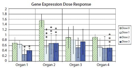
Figure 10.11.Fold change (log2) expression of a gene of interest relative to a pair of reference genes, relative to the expression in the sample with lowest expression within each organ type. Bar heights indicate mean expression of the gene in several samples in groups of non-treated (Dose 0) samples or samples treated at one of three different drug doses (Dose 1, Dose 2, and Dose 3). Error bars indicate 95% confidence interval estimates of the mean expressions. One asterisk indicates statistically significant difference between the means of a treated sample set compared to the mean of the non-treated sample set to 5%; two asterisks indicate statistically significant difference to 1%; three asterisks indicate statistically significant difference to 0.1%.
Given that the asterisk notation hides the absolute value of p, it is often encouraged to include a table with the absolute values of p, as shown in the example in Table 10.5. One reason behind this is that a p-value of for example 0.032 is only slightly more “significant” than a p-value of 0.055. Borderline cases like this can lead to some confusion when deciding precisely what cut-off to use when classifying data as significant. In realistic cases, a p-value of 0.051 could be just as significant as a p-value of 0.049, yet a strict (although fundamentally arbitrary) cut-off of 0.05 would classify one as significant and the other not.
However, there is a variant of the bar diagram visualization that takes advantage of the confidence interval of the difference between means to avoid many, if not all, of the disadvantages of traditional bar diagrams24. With the confidence interval of the difference between means, it is possible to estimate directly the statistical significance with associated error bars while at the same time highlight biological effect size and data variability. Figure 10.12 shows the variant with the confidence interval of the difference between means of the data used in Figure 10.11. Notice that confidence intervals that do not encompass the zero difference between means correspond to significant results at the confidence level corresponding to the p-value cut-off (5% in Figure 10.11 and Table 10.5).
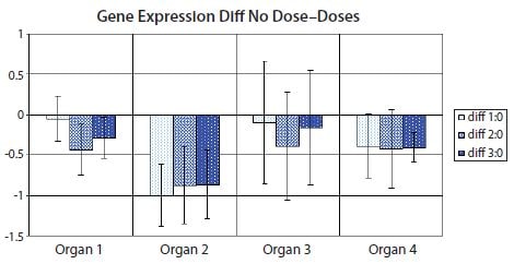
Figure 10.12.Bar diagram showing the difference between means of the nontreated sample set (Dose 0) and one of the treated sample sets (Dose 1, Dose 2 or Dose 3) in the data set from Figure 10.11. Error bars show the confidence interval of the difference between means. Error bars that do not cross the x-axis indicate the corresponding means comparison is statistically significant to 5% in a t-test. PCR Technology, Current Innovations-3rd ed. by Taylor and Francis Group LLC Books. Reproduced with permission of Taylor and Francis Group LLC Books in the format reuse in a book/e-book via Copyright Clearance Center.
Multivariate data are data collected on several variables for each sampling unit. The data used in Figures 10.11 and 10.12 are multivariate in that they depend on variables such as dose and organ type. However, the statistical analyses in Figures 10.11 and 10.12 are nevertheless univariate in that each representation (bar) only illustrates one variable, gene expression, relative to fixed measures of the other variables. For multivariate data analysis techniques, hierarchical clustering and principal component analysis are good options for data representation.
Hierarchical Clustering
One of the easiest and useful methods to characterize data is by plotting the data in a scatterplot (for example plotting measured Cq values of one gene against the corresponding Cq values of another gene for a set of biological samples in a 2D plot). Plots in one or two dimensions are conveniently visualized by human eyes. Plots in three dimensions may also be possible with appropriate tools, but higher dimensional plots are significantly harder to visualize. However, for exploratory studies, the data set is inherently multidimensional and scatterplots of whole data sets may thus become impractical. From a qPCR data set, there may be, for example, several genes and/or several types of biological samples represented.
A popular, alternative way of characterizing and visualizing data from exploratory studies is to analyze measures of distances between data points in the scatterplot. Different distance measures exist, including Euclidean, Manhattan and Pearson correlations. With computational power, it is straightforward to calculate distances, even for multidimensional data of much higher dimensionality than three dimensions. For agglomerative hierarchical clustering, the following iterative process is performed: 1) Find the two closest objects and merge them into a cluster; 2) Define the new cluster as a new object through a clustering method; 3) Repeat from 1) until all objects have been combined into clusters30. Alternatives for clustering methods include Ward’s method, Single linkage and Average linkage31. A dendrogram is often used to visualize results from hierarchical clustering.
Interpretation of hierarchical clustering dendrograms of qPCR data often results in conclusions about gene expression profile similarities. In an exploratory study, these similarities may then be used to formulate hypotheses about gene expression coregulation, which may be accepted or rejected in subsequent confirmatory studies. The advantages of hierarchical clustering dendrograms include the clarity by which similarity relationships are visualized. On the other hand, the strong emphasis on similarity measures may be perceived as limiting with respect to formulating hypotheses, since similar expression profiles may be redundant attributes in hypotheses. It may be of higher value to identify sets of expression profiles that complement each other in a specific combination, to answer the desired hypothesis.
Principal Component Analysis
Another popular, alternative way to characterize and visualize data from exploratory studies is to take advantage of the information contained in the whole, multidimensional data set, select desired properties and project it to a lower dimensional scatterplot, such as a 2D or 3D plot. This can be achieved using principal components analysis (PCA)32,33,34, 35. Here, the original coordinate system of the data set (i.e., the expression profiles measured by qPCR) is transformed onto a new multidimensional space where new variables (principal components: PC or factors) are constructed. Each PC is a linear combination of the subjects in the original data set. By mathematical definition, the PC’s are extracted in successive order of importance. This means that the first PC explains most of the information (variance) present in the data, the second less and so forth. Therefore, the first two or three PC coordinates (termed scores) can be used to obtain a projection of the whole data set onto a conveniently small dimension, suitable for visualization in a 2D or 3D plot. By using the first two or three PCs for representation, the projection that accounts for the most variability in the data set is obtained. Variance from experimental design conditions is expected to be systematic, while confounding variance is expected to be random, so this representation may be desired under appropriate conditions.
As previously noted for hierarchical clustering, the interpretation of qPCR PCA often results in conclusions about gene expression profile similarities. Although PCA and hierarchical clustering may yield complementary insights into gene expression co-regulation patterns, both techniques focus on gene expression profile similarities. This places limitations on the types of hypotheses that can be found in exploratory studies using these techniques alone. To expand on the reach of generated hypotheses in exploratory studies, a hypothesisdriven approach to multivariate analysis was recently proposed24. Hypothesis-driven, custom-designed algorithms may identify biologically relevant hypotheses that may otherwise be missed by commonly used techniques for multivariate data analysis.
Materials
To continue reading please sign in or create an account.
Don't Have An Account?